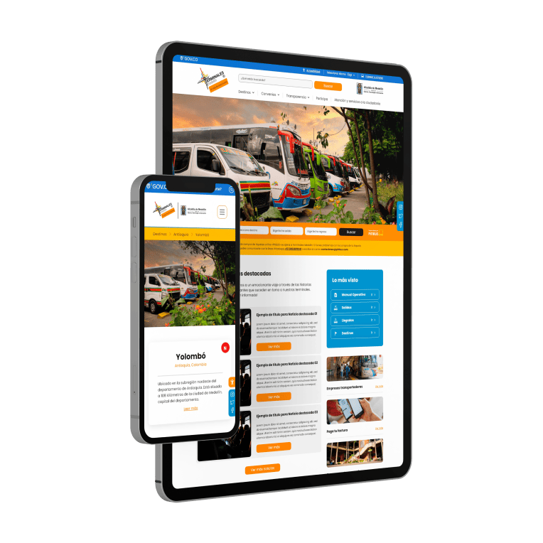
Terminales Medellín faced a challenge in terms of digital identity and functionality. Its website did not adequately represent the scale of the institution, and the experience of searching and consulting transportation services from its south and north terminals was confusing and incomplete.
This affected both local citizens and visitors, who expected to find a modern and efficient platform to explore routes, pay for services, and access mandatory public information from a state entity. From a UX/UI and development perspective, creating a website that integrated all these functions in an agile and accessible way was essential to improve the perception and usability of the portal.

We opted for a visual design that highlights the seriousness and professionalism of Terminales Medellín, using sober but warm color palettes, along with an intuitive structure that allows effortless exploration of each of the site's sections. The main page features a prominent route search engine, easy to find and use.
In addition, we implemented advanced options for consulting commercial premises, bill payments, and quick access to citizen services and transparency, with coherent and direct navigation. From the development stage, the site was created with high accessibility standards and compliance with government regulations, guaranteeing security, transparency and an accessible space for all.